 Account
 Projects
 Log Out


 Home
HomeScatter Plot Beginner's Guide


Why Choose a Scatter Plot?
A scatter plot is a simple yet powerful tool for visualizing data on XY axes. Unlike bar charts and line charts, scatter plots can also show an extra dimension through point size, making it easy to spot trends and outliers at a glance.
What Data Is Suitable for a Scatter Plot?
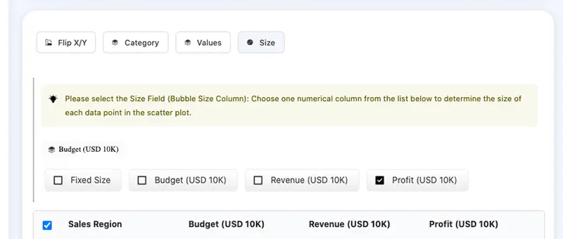
The requirements for a scatter plot are straightforward. You’ll need at least two columns (one must be numeric). If you have three or more columns, one of them can be used for point size. Here’s an example:
| Sales Region | Budget (USD 10K) | Revenue (USD 10K) | Profit (USD 10K) |
|---|---|---|---|
| Northeast | 120 | 350 | 22 |
| Midwest | 180 | 500 | 85 |
| Southeast | 150 | 420 | 70 |
| Southwest | 90 | 200 | 30 |
| Pacific | 70 | 150 | 20 |
| Mountain | 60 | 180 | 25 |
| Central | 100 | 300 | 40 |
This data is great for a scatter plot. You could use "Sales Region" for the X-axis and "Budget" for the Y-axis to easily compare budgets across regions. "Revenue" or "Profit" can be used for point size, helping you analyze each region’s performance in one chart. I’ll show you how to create a scatter plot in the next section.
Typical Use Cases for Scatter Plots
Scatter plots are useful in many scenarios, such as:
- Business Analysis
Comparing input vs. output, ad spending vs. sales, or ad cost vs. click-through rates. - User Research
Analyzing the relationship between user age and purchase frequency in e-commerce, or studying user group distributions. - Scientific Research
Looking at how different seed varieties grow at different temperatures and how much they yield.
When you want to find patterns, uncover trends, or spot anomalies, scatter plots help you quickly see whether relationships exist and how strong they are.
How to Make a Scatter Plot?
Creating a scatter plot with EveChart takes just three steps:
Step 1. Prepare Your Data File
Your file can be an Excel or CSV file. Before uploading, double-check for missing, incorrect, or invalid data (for example, non-numeric values in numeric columns).
Step 2. Upload the Data File
Go to the EveChart homepage (https://evechart.com).
Click "Upload File" and select your prepared data file.
Step 3. View Your Scatter Plot
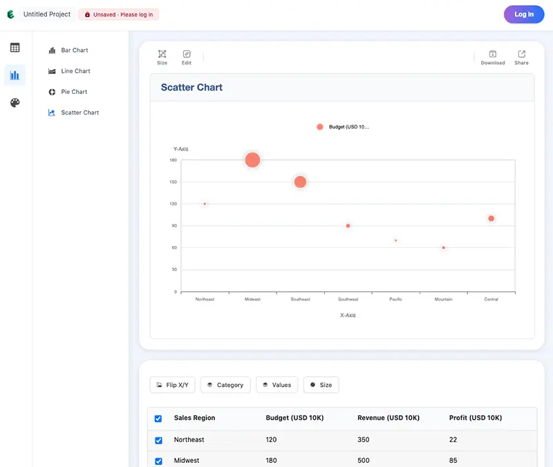
After uploading, the file is parsed automatically. Click "View Chart" to open the chart page. EveChart will detect your data and suggest the best chart type. Sometimes it might default to a bar chart, like this:
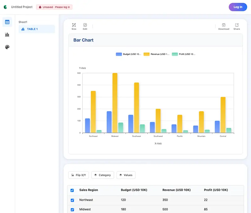
If that happens, simply select "Scatter Plot" on the left to switch.
That’s it! In three quick steps, you can turn a data table into a scatter plot without memorizing any commands.
Optimizing and Exporting Your Scatter Plot
Customize Your Scatter Plot
You can customize the scatter plot however you like. EveChart offers several themes you can switch with one click. You can also edit the chart title and X/Y axis labels.
Exporting Your Scatter Plot
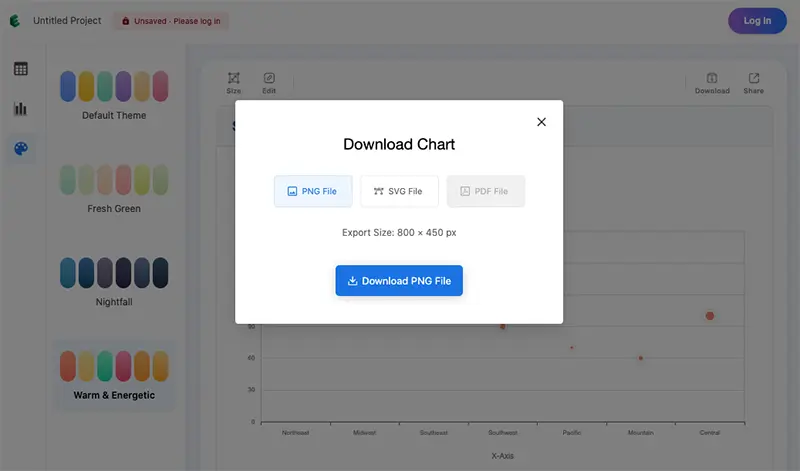
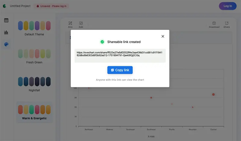
You can export your chart as an image or a shareable link.
Export as an Image
Click the "Download" icon at the top of the chart. Choose your preferred format (PNG or SVG), then click "Download".
Share as a Link
Alternatively, you can share your chart via a link so others can view and interact with it. Just click "Share" at the top, copy the link, and send it.
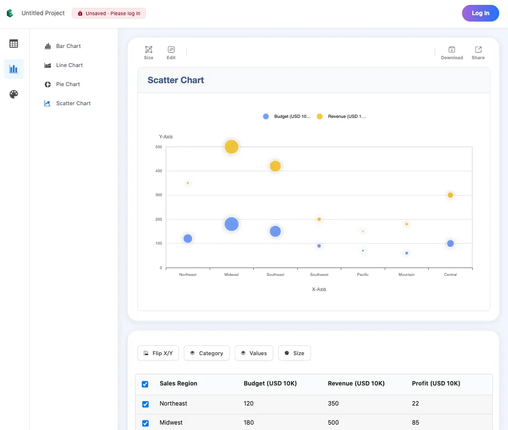
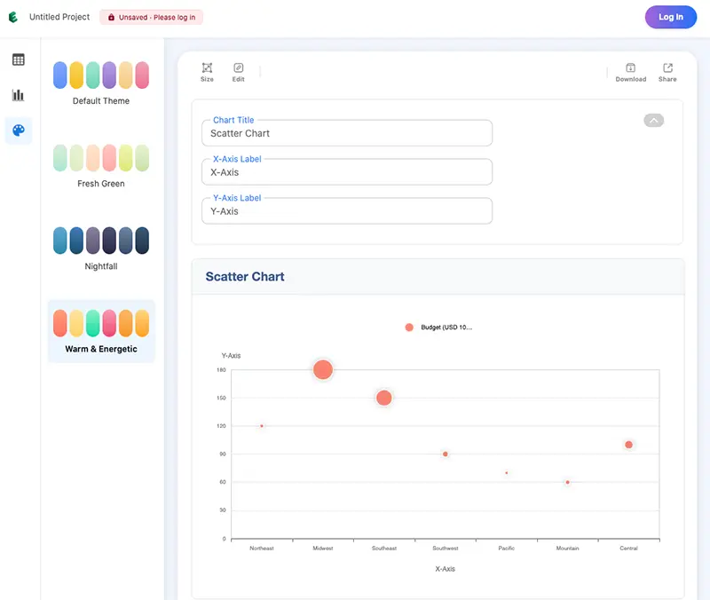
How to Interpret a Scatter Plot?
Let’s say you want to understand regional sales performance. You might set the X-axis to "Region," the Y-axis to "Budget," and point size to "Profit." Here’s how it looks:
In this plot, higher points indicate higher budgets. "Midwest," for example, has the largest budget and sits highest on the Y-axis. The point size shows profit. Usually, a bigger budget should mean higher profit (larger points). But here, "Northeast" has a high budget but a small point, suggesting underperformance. When comparing many regions — even 200 at once — the scatter plot helps you quickly spot issues and analyze them further.
Frequently Asked Questions (FAQ)
My scatter plot has too many data points and looks messy. What can I do?
Select rows in the data table; only selected rows will be shown. The number of X-axis points matches the number of selected rows.
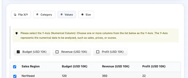
My data has categories. Can I show them in different colors?
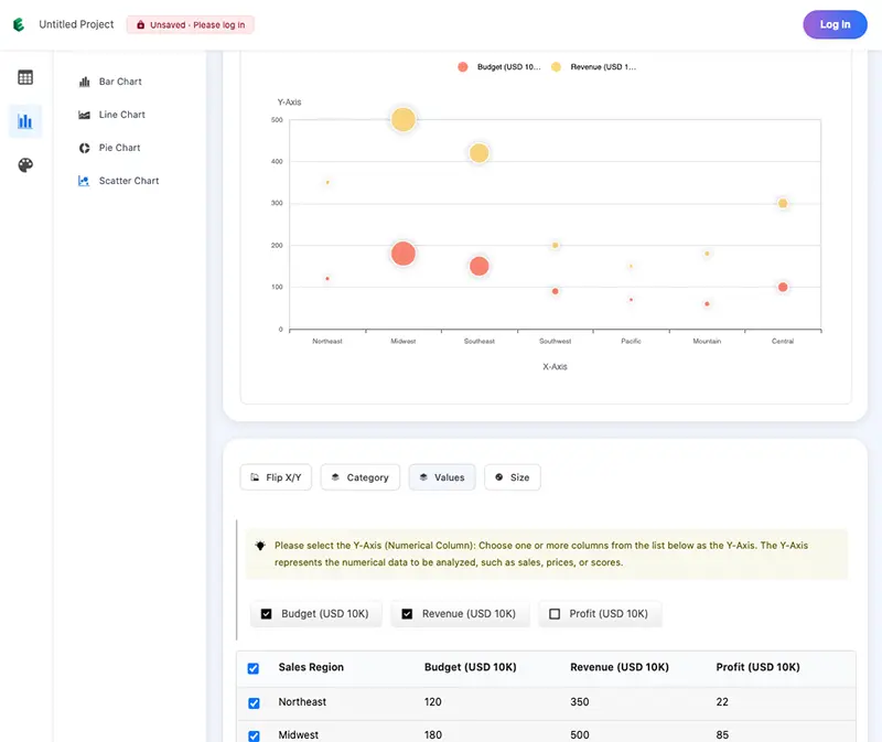
Yes. For example, to show both budget and revenue, select both "Budget" and "Revenue" under "Values".
How many data points work best in a scatter plot?
Scatter plots work best with 10–1,000 points, especially when using a continuous numeric X-axis. If your X-axis is categorical, it’s better to keep the number of categories to a few dozen so they don’t overlap.
Can EveChart save my scatter plot?
Yes. As long as you’re logged in, your new charts and edits are saved automatically.
 EN
EN