 Account
 Projects
 Log Out


 Home
HomePie Chart Quick Start Guide


Why Choose a Pie Chart?
A pie chart is an intuitive way to visualize the proportion or importance of category-based data. Compared to bar charts and line charts which are usually more precise, pie charts do not emphasize the exact value of data points, but rather focus on the proportional relationship between parts. Because of this, pie charts are often used in presentations to give a clear overall representation of data.
What Type of Data is Suitable for a Pie Chart?
Pie charts are suitable for scenarios where you need to compare the proportional share of each item, and when the number of items is relatively low. For example, the table below shows the budget allocation across different channels. This type of data is perfect for a pie chart: it clearly shows each channel’s share and remains readable due to the limited number of items.
| Department | Budget (USD) |
|---|---|
| Social | 25000 |
| Search Ads | 30000 |
| Content | 18000 |
| 12000 | |
| Affiliate | 8000 |
| Influencers | 15000 |
| Events | 10000 |
Typical Use Cases for Pie Charts
The following scenarios are all suitable for pie chart visualizations:
- Market share analysis - showing the share of different brands or products.
- Budget allocation and expense analysis - e.g., household monthly expenses or department budgets.
- User composition analysis - such as user source channels, regional distribution, or device type ratios.
- Survey result visualization - e.g., showing respondent preferences.
For example:
If you want to show a breakdown of your website's traffic, where App contributes 35%, Web contributes 45%, and Browser Extensions contribute 20%, a pie chart makes it easy to convey "which is the most important".
How to Convert Data into a Pie Chart?
Using EveChart to convert data into a pie chart only takes 3 simple steps:
Step 1: Prepare Your Data File
EveChart currently supports Excel and CSV formats. Using the budget table mentioned above as an example, check your data before uploading to ensure there are no missing items, duplicate entries, or incorrectly formatted cells (for example, the budget column must contain numeric values. If a non-numeric value is entered, it won’t display in the chart).
Step 2: Upload the Data File
Go to EveChart homepage: evechart.com
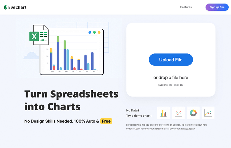
Click the “Upload File” button and select the prepared file to upload.
Step 3: View the Generated Pie Chart
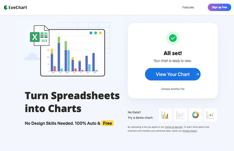
Once the upload is complete, the system will automatically parse the file. Click the “View Chart” button to open the chart display page.
EveChart will try to determine the best chart type based on your data. If it’s not shown as a pie chart by default, simply select “Pie Chart” from the chart type selector.
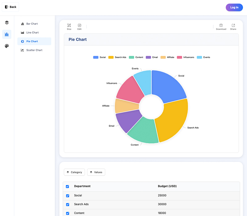
At this point, your data has been successfully converted into a pie chart.
You can hover over each slice to view the exact values.
You can also dynamically adjust which items are shown—for example, if you want to hide the "Content" category, just uncheck that row, and the chart will update automatically.
Optimizing & Exporting the Pie Chart
Chart Optimization and Styling
You can further optimize your pie chart—both the data and the visual styling.
Data Optimization Tips:
- Only select rows that need to be displayed.
- Avoid displaying too many items (more than 20 rows is not recommended).
- Too many rows will result in overly small slices and a less readable chart.
- Consider merging similar items to reduce total row count.
Naming Rules:
- Click any cell to edit data directly.
- Keep item names short and clear.
- If two or more rows share the same name, EveChart will automatically add their values together in the pie chart. This may lead to unintended results—please check for duplicates.
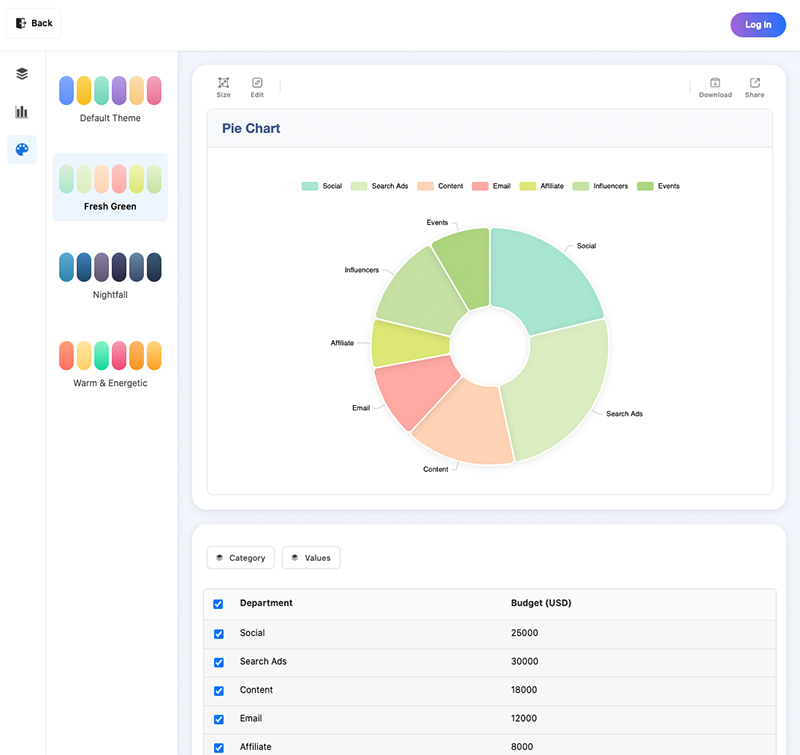
Styling Options:
- EveChart offers a set of themes.
- Simply click on your preferred theme, and the chart will update in real time.
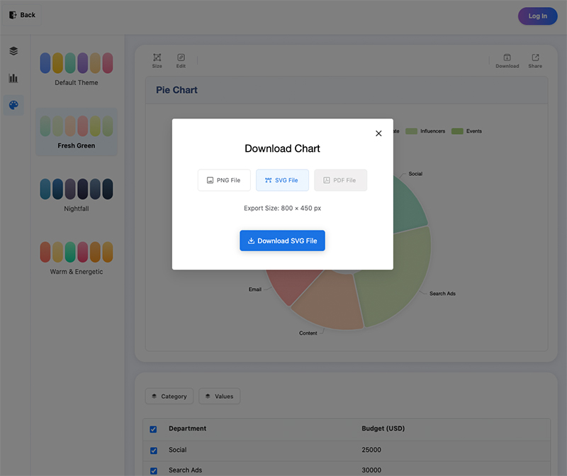
Downloading the Pie Chart
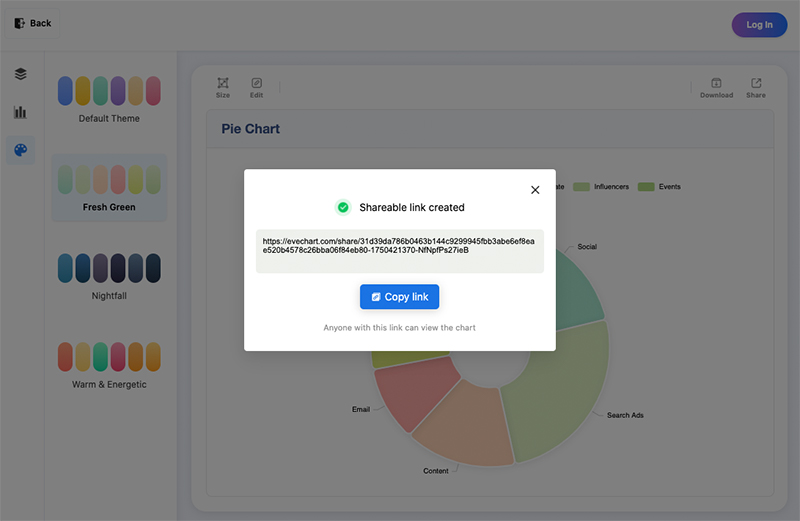
You can download your pie chart as an image or share it via a public link.
Export as Image
Click the “Download” icon above the chart.
In the dialog, choose your preferred format (currently PNG and SVG are supported).
Click “Download” to save the image to your device.
Export a Shareable Link
Exporting a link gives you a more flexible way to share your chart.
People who open the link can interact with the chart by hovering or clicking.
Click the “Share” icon above the chart and copy the generated link to send to others.
Frequently Asked Questions (FAQ)
Why Does My Pie Chart Only Show One Category?
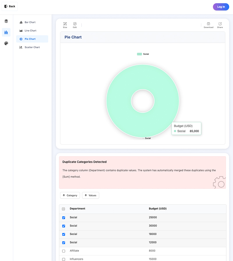
In this extreme example, the pie chart only shows a single item.
Why? Because the 4 selected rows have the same category name.
When hovering over the chart, you’ll see the total budget is $85,000, which is the sum of all four duplicates.
How Do I Edit the Pie Chart Title?
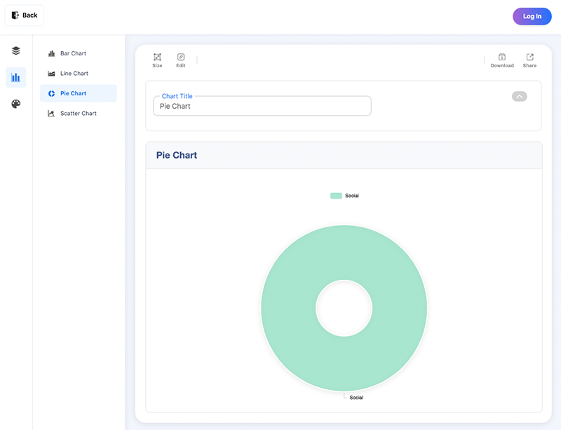
Click the “Edit” icon above the chart.
A title editing panel will slide in.
After updating the title, the chart will reflect changes in real time.
 EN
EN