 Account
 Projects
 Log Out


 Home
HomeLine Chart Quick Start Guide


How to Convert Data into a Line Chart?
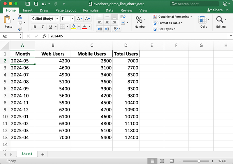
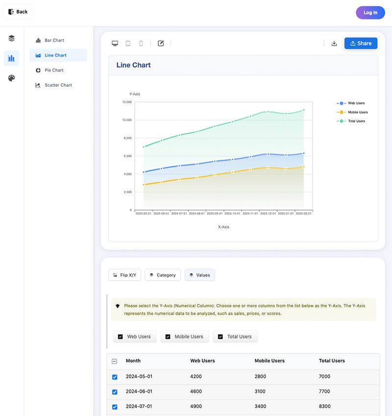
Using EveChart to generate a line chart is simple: just prepare an Excel or CSV file with your table data. For example, the table below shows monthly user statistics from May 2024 to April 2025. This kind of table, sorted by date, is very suitable for displaying as a line chart.
| Month | Web Users | Mobile Users | Total Users |
|---|---|---|---|
| 2024-05 | 4200 | 2800 | 7000 |
| 2024-06 | 4600 | 3100 | 7700 |
| 2024-07 | 4900 | 3400 | 8300 |
| 2024-08 | 5100 | 3600 | 8700 |
| 2024-09 | 5400 | 3900 | 9300 |
| 2024-10 | 5600 | 4200 | 9800 |
| 2024-11 | 5900 | 4500 | 10400 |
| 2024-12 | 6200 | 4700 | 10900 |
| 2025-01 | 6100 | 4600 | 10700 |
| 2025-02 | 6300 | 4800 | 11100 |
| 2025-03 | 6700 | 5100 | 11800 |
| 2025-04 | 7000 | 5400 | 12400 |
Step 1. Prepare Your Data File
The data file format can be xls, xlsx, or csv. The data file needs to contain at least one complete table (at least two columns and multiple rows of data), like in the table above.
Before uploading your data file, open it to check whether the data meets your expectations. For example, if you want to display the monthly changes in web and mobile users, make sure the time (e.g. “Month”) column is in chronological order.
Step 2. Upload the Data File
Go to the EveChart homepage (https://evechart.com)
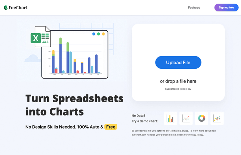
Click the “Upload File” button and select the data file you have prepared to start uploading.
Step 3. View the Generated Line Chart
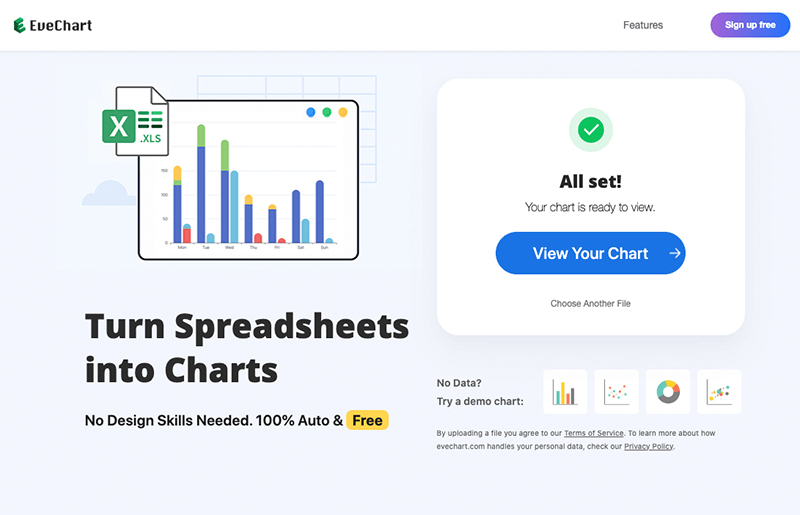
When the data has finished being processed, click the “View Chart” button to view the chart page.
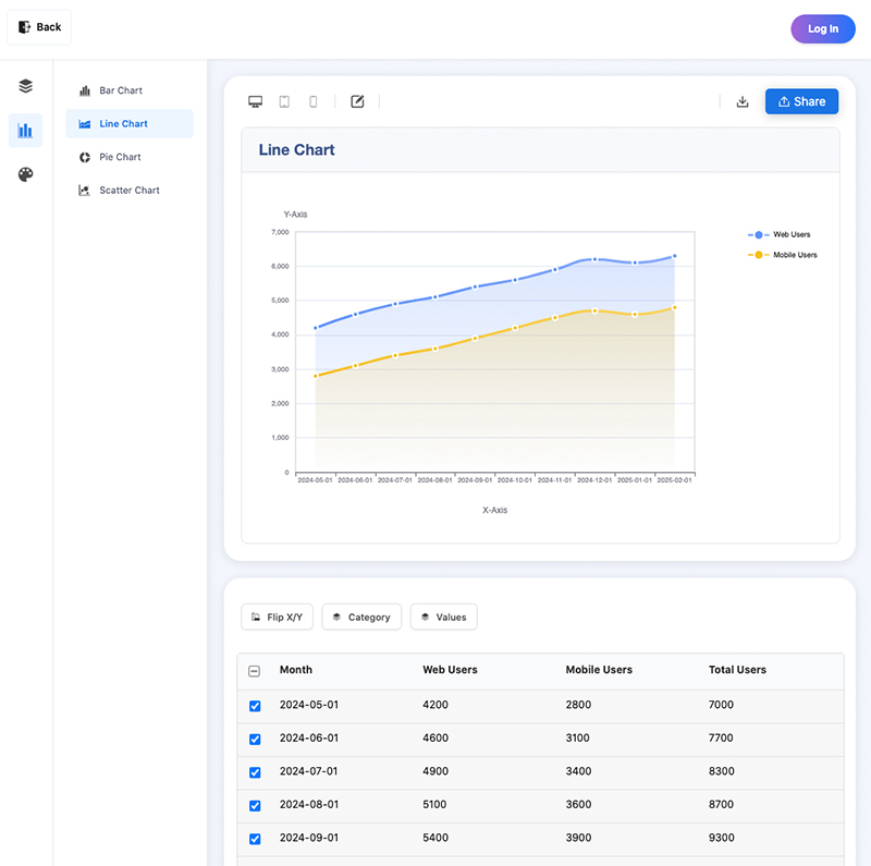
If needed, you can adjust the chart display; for example, as well as showing the “Web Users” and “Mobile Users” values, we may also want to display the “Total Users” value. To do this, click the “Values” button, check the box for “Total Users”, and the line chart will update in real time.
What Types of Data Are Suitable for Line Charts?
Line charts are one of the most common ways of representing time-related data, such as:
- Data that changes over time: daily temperature changes, monthly sales, annual population changes, stock prices, etc.
- Data with a continuous relationship: heart rate changes, temperature records of a chemical reaction, etc.
- Data showing trends: comparison of different product sales over seasons, temperature trends across multiple cities, etc.
- Accumulated or growing data: cumulative user registrations, total funds in a pool, etc.
- Forecast vs. actual data: comparing predicted and actual sales over time, budget vs. actual spending, etc.
In short, if your data has “order”, “continuity”, or if you want to express a “trend,” a line chart is usually a good choice.
Beautifying and Exporting Your Chart
Beautifying the Chart
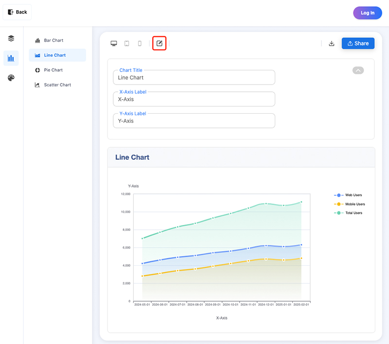
You can beautify the generated chart as needed - for example, by modifying the chart title, X-axis title, or Y-axis title to improve readability. This is very easy, just click the edit button above the chart to expand the editing area where you can freely edit these titles.
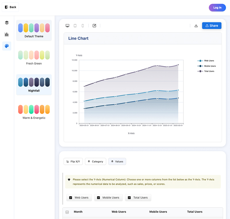
Besides editing titles, EveChart also offers a variety of chart themes. Click the “Themes” section in the left sidebar and select your preferred theme style, as shown below:
Exporting the Chart
You can export the generated chart as an image or a shareable link.
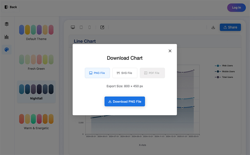
Export as an Image
Click the “Download” icon above the chart, and then select the image format to export. Currently, PNG and SVG formats are supported, but more formats will be added in the future. Click the “Download” button to complete the download.
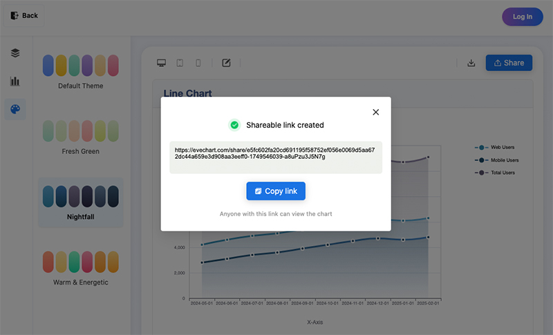
Export as a Link
Exporting your chart as a link makes it easy to share with others; they will be able to interact with the chart, but not update its values. To export your chart as a link, just click the “Share” button above the chart, then click “Copy Link”, and share the copied link with anyone you want to access the chart.
Frequently Asked Questions (FAQ)
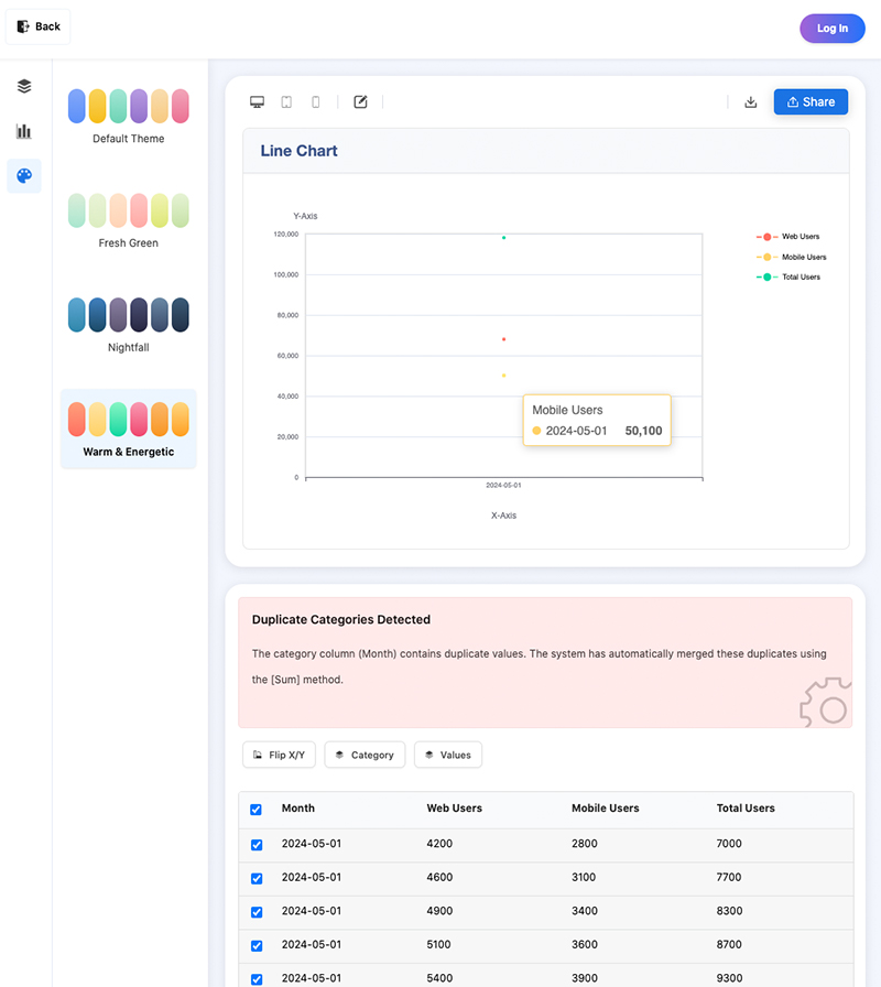
Why is my chart blank after uploading the data file?
If your chart doesn’t display correctly after uploading, it’s usually because the data is missing or doesn’t meet the requirements for a line chart, such as having empty values in the selected “Values” column. Another situation is when the data table has no empty values, but the chart only shows three points and no line. This happens if the category column (the “Month” column in the examples above) contains duplicate values; the chart will automatically aggregate the values for duplicate entries.
How do I display select parts of the data in the chart?
This is a common use-case; your data may contain thousands of rows, but you only want to display some of them in the chart. To do this, simply select the rows you want using the checkboxes on the left of the table to limit what is shown in the chart.
Can I edit the uploaded data?
Yes, you can edit the data in the table at any time. Simply click a cell to edit it. If data is deleted or the input format is incorrect, the cell will be highlighted.
 EN
EN