 Account
 Projects
 Log Out


 Home
HomeBar Chart Quick Start Guide


How to Convert Excel Data into a Bar Chart?
To generate a bar chart, your spreadsheet only needs to include one column of category information (e.g., product, region, date, etc.) and one or more columns of numeric fields (e.g., sales volume, revenue, etc.). The system will automatically detect these columns and generate the corresponding chart.
Example: We have a table that records the sales volume and revenue of various fruits. This table is perfect for creating a bar chart.
| Product | Units Sold | Revenue |
|---|---|---|
| Apple | 1200 | 9600 |
| Banana | 950 | 6650 |
| Orange | 870 | 6090 |
| Watermelon | 1340 | 10720 |
| Grapes | 780 | 5460 |
| Mango | 660 | 5280 |
| Kiwi | 520 | 4160 |
| Blueberry | 430 | 3870 |
Converting this table into a bar chart automatically only takes a few simple steps:
Step 1. Prepare the Data File
We already have a table of fruit sales. This can be an Excel .xls or .xlsx file, or a .csv file.
Step 2. Upload the Data File
Go to the EveChart homepage (evechart.com)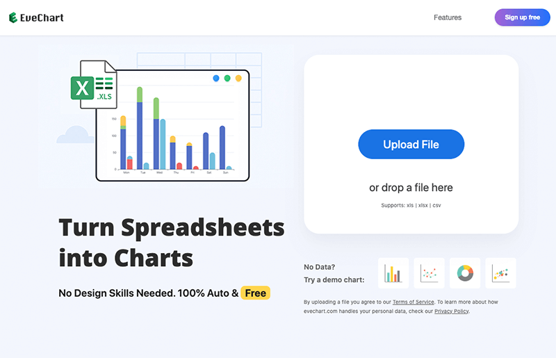
Click the “Upload File” button, select your data file, and start uploading.
Step 3. View the Generated Bar Chart
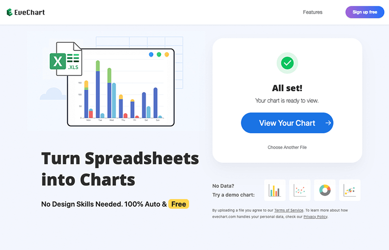
Once the data file is uploaded, you can click the “View Chart” button to open the chart page. Here you will see the bar chart that has been created automatically.
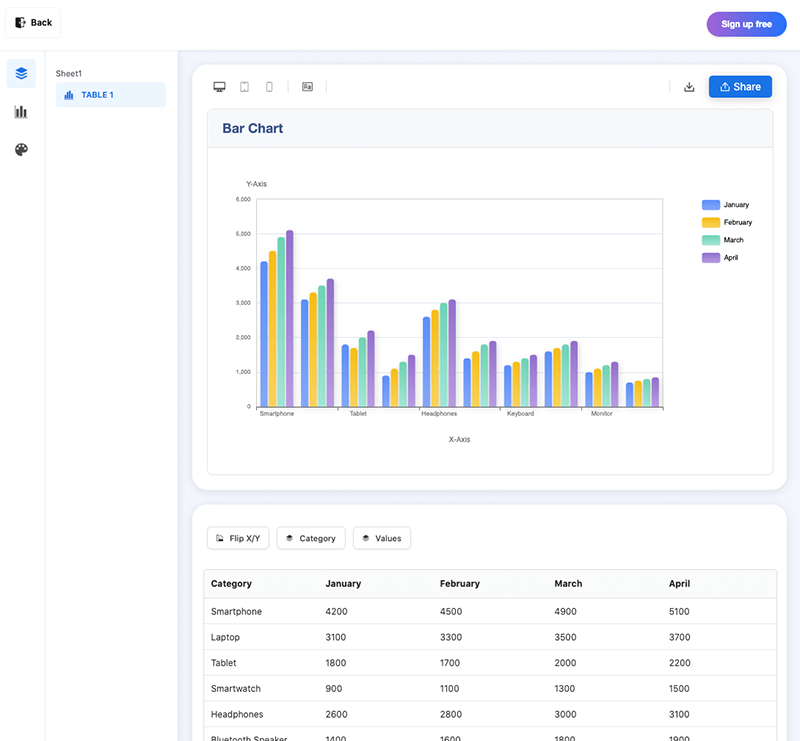
You’ve now successfully converted your data into a beautiful bar chart, without writing any code or memorizing complex formulas.
When is a Bar Chart most Suitable?
Bar charts are ideal for clearly comparing values across items, and work best in the following scenarios:
Comparing the Performance of Different Items
You have multiple objects (e.g., products, cities, departments) and want to know which performs better in terms of sales, quantity, or other values.
Examples:
- Monthly sales volume for different products
- Annual revenue across regions
- Spending comparisons by category
👉 One category column + one numeric column = perfect for bar charts.
Comparing Multiple Data Series for the Same Items
You want to show multiple series side by side, such as different sales channels or time periods.
Example:
| Product | Online Sales | Offline Sales |
|---|---|---|
| A | 800 | 600 |
| B | 900 | 720 |
👉 Multiple value columns + one category = great for grouped bar charts.
Using Time on the X-axis to Show Metrics over Time (More Intuitive)
Although time series data is often shown with line charts, if you don't need to see data across time, bar charts can work well for easy comparisons.
Examples:
- Daily sales volume by product
- Monthly visitors by channel
- Quarterly department budget usage
👉 X-axis is time, with multiple bars per group for clear comparisons.
When Not to use a Bar Chart:
- When showing proportions / percentages / ratios, etc. ➜ Use a [Pie Chart]
- When showing trends ➜ Use a [Line Chart]
Exporting and Sharing your Bar Chart
Once your chart is ready, you can use it in reports, presentations, or share it directly. We aim to make all actions take only one click, however we are in early access and two sharing/export methods are supported:
Export as Image
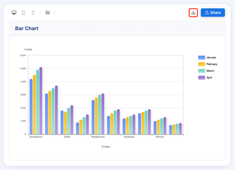
On the chart page, click the “Download” button in the upper-right corner to save the chart as a PNG image.
Share Chart Online
Click the “Share” button in the upper-right corner to generate a shareable link for a read-only copy of your chart that you can send to anyone, such as colleagues or clients. It can be accessed long-term and is great for report appendices or project backups.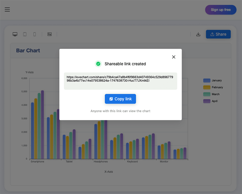
When opened via the share link, the chart will be visible, but the original data will not be displayed.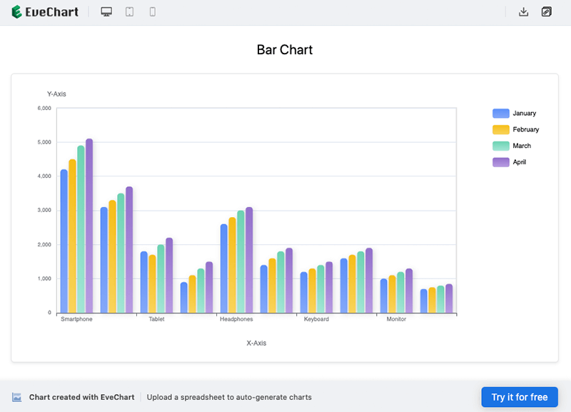
Frequently Asked Questions (FAQ)
I uploaded my Excel file, but no chart was generated. Why?
Please make sure your table includes at least one category column (e.g., product name) and one numeric column (e.g., sales volume). Merged cells, empty rows, or empty columns may also interfere with detection. Additionally, if all values in the category column are identical, no chart will be displayed.
What file formats are supported? Is there a file size limit?
We support .xlsx, .xls, and .csv formats. For a smooth experience, we recommend keeping files under 5MB.
Can I upload files with multiple sheets?
Yes, the system will automatically parse all sheets. On the chart page, you can switch between them freely.
Can bar charts be displayed horizontally?
Yes. After the chart is generated, you can switch between vertical and horizontal layouts.
Can others modify the chart from a shared link?
No. Shared links are read-only. Others can view the chart, but not edit it or access the source data.
Are shared chart links permanent?
Links remain valid long-term. In the future, we may support expiration dates and access controls.
I’m concerned about data security. Is it safe?
We take data privacy very seriously. Your uploaded file includes two parts:
The original file (your Excel/CSV), which is temporarily stored on the server to support chart generation. In the future, we plan to introduce an automatic deletion mechanism.
The preprocessed chart data (used to render the chart), which is retained so you can revisit or edit your chart later.
In the current version, charts are not made public unless you explicitly generate a shareable link. You can delete a chart at any time, and doing so will remove all associated data, including the original file and preprocessed data.
We will never use your data for anything other than generating your chart. We don’t share it, nor use it to train models. You are in full control, and we’ll offer more flexible privacy options going forward.
 EN
EN