 Account
 Projects
 Log Out


Where Bar Chart is Used ?

Bar charts are one of the most common chart types, with clear expression and wide applications. However, while they may seem simple, not all data or scenarios are suitable for bar charts.
In this article we will explain when bar charts are the most appropriate choice, and when you should avoid using them to prevent common mistakes.
Want to see who’s higher or lower? Bar charts are the most straightforward
Sometimes you don’t need complex data analysis, you just want to quickly see in your Excel sheet which item has the highest or lowest value, such as:
- Which product sells the best?
- Which city has the highest housing prices?
- Which channel brought in the most users?
In these situations, bar charts present the data very clearly. For example, the chart below shows monthly sales of various electronics products.
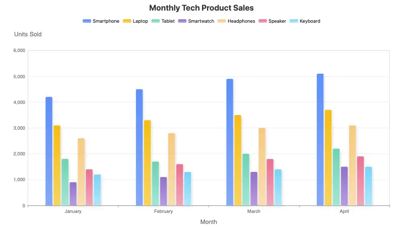
You can clearly see that smartphone sales are the highest each month, while smartwatch sales are the lowest. It’s far more intuitive than reading a data table in Excel.
Is your data categorized (not continuous over time)? Then bar charts are a no-brainer
If your data isn’t time-based, but is grouped by discrete categories such as "people," "products," "countries," or "departments," like:
- Electric vehicle sales by country
- Average scores by subject
- User count by age group
These types of data don’t follow any time sequence and do not require trend analysis. You just want to compare values across different categories - that’s exactly where bar charts shine.
Here’s an example. Suppose you’re analyzing an app’s user age distribution. You get the following data:
| Age Group | User Count |
|---|---|
| 18–24 | 5200 |
| 25–34 | 8300 |
| 35–44 | 6100 |
| 45–54 | 3300 |
| 55+ | 1800 |
You're not tracking how these age groups change over time or how they relate proportionally. You simply want to know: which group is the largest? Which is the smallest?
In this case, a bar chart clearly expresses the difference.
⚠️ Quick Note
If you have over 20 categories, for example housing prices across 300 cities, the bar chart might get too crowded. You could consider showing just the Top 10 in a bar chart or grouping cities by province and charting them separately.
Not interested in trends—just want to compare now? Bar charts beat line charts hands down
Just because your data includes time doesn’t mean you must use a line chart. You need to think about your chart’s purpose.
If you’re simply trying to show:
- Which channel brought in the most registered users last month?
- Department spending this quarter
- Which day had the best or worst sales
Then what you really care about is point-by-point comparison, not trends over time. In this case, bar charts make the message clearer than line charts.
Why line charts aren’t ideal here
Line charts are great for telling a "story", like how something increases over time or drops suddenly.
But if your data is just a summary (not meant to show progression), using a line chart could mislead your audience into thinking you're showing a trend.
Advantages of bar charts in this situation
- One bar per time point, no connecting lines, no implied continuity
- Differences stand out immediately—key info pops
- Bars can be color-coded or labeled to highlight specific values
Big differences? Want visual impact? Bar charts best reveal "contrast"
Sometimes, the gap itself is the story. For example:
- The top-selling product sells 10x more than the lowest
- One ad channel’s conversion rate massively outperforms others
- A city’s spending far exceeds the national average
In these cases, you don’t want people to read numbers—you want them to feel the difference.
Since the human eye is naturally good at comparing lengths, a bar chart where one bar is twice as tall as another makes the point instantly—no math required.
Few data entries? Bar charts are simple, elegant, and smooth
Have you ever had just a handful of data points, but tried to make them look fancy with a "complex" chart—only to end up with something confusing?
Exactly. If you only have, say, 3–10 items, bar charts are your best option, because:
- Bar charts have a simple structure: clean and uncluttered
- Easy to compare: height difference is instantly visible
- Efficient use of space: cleaner than tables, clearer than pie charts
Category labels too long? Use horizontal bar charts
Sometimes category names are too long and clutter the bottom of your vertical bar chart. Labels may overlap or get truncated.
In that case, simply switch to a horizontal bar chart, like the example below:
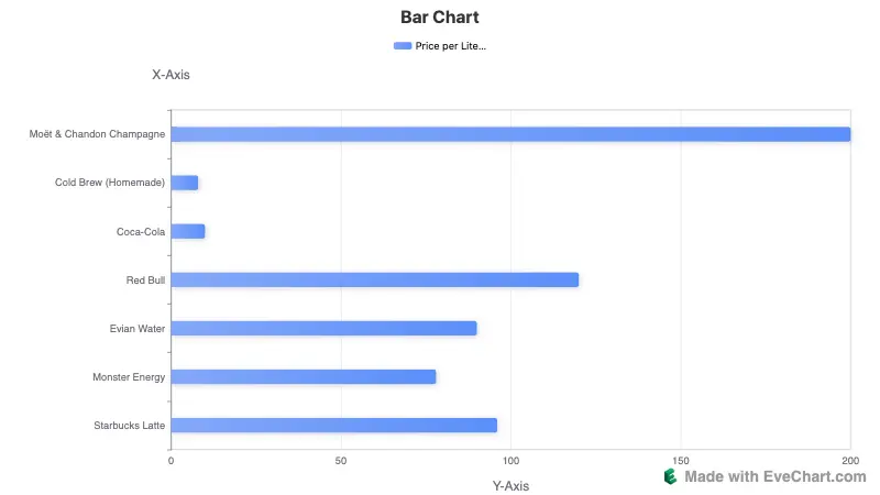
EveChart provides a one-click button to switch between vertical and horizontal layouts.
For a detailed guide on how to convert Excel data into bar charts using EveChart, check out:
"Bar Chart Quick Start Guide"
When should you NOT use a bar chart? Here’s a simple rule of thumb
Bar charts are great, but they’re not for everything. Sometimes using a bar chart will confuse your audience or send the wrong message.
Here are a few cases where bar charts are not recommended:
❌ Want to show a trend over time? Skip the bar chart
If you're showing how data changes over time, like:
- Sales trends throughout a year
- Daily user activity levels
- Monthly website traffic
Use a line chart instead. It’s better for showing continuous changes.
❌ Want to highlight part-to-whole relationships? Bar charts aren’t always ideal
If your goal is to show what portion each category represents of the whole, then:
Pie charts, stacked bar charts, or donut charts will do a better job than plain bar charts.
❌ Too many categories? Bar charts will get crowded
Bar charts are not suited for large datasets, like:
- Data on 100 products
- Comparisons between 300 cities
Too many items will make your chart cluttered, with bars that are too thin to read. Viewers will just see "a wall of lines"—and miss your point entirely.


 EN
EN