 Account
 Projects
 Log Out


When to use a line chart ?

Line charts are most suitable for showing trends. For example, changes in temperature over a period of time, the growth of website traffic, or fluctuations in a company’s quarterly revenue can all be represented clearly with a line. Their value lies in allowing people to see at a glance whether the data is rising or falling, stable or volatile - something far more intuitive than just looking at raw numbers. In the following sections, let’s look at some common examples of when line charts should be used, and when they should be avoided.
Line chart use cases
The advantage of a line chart is that it can turn a series of cold numbers into a vivid curve, making it immediately clear whether the data is going up, down, or fluctuating. Especially when data is tied to time, a line chart is almost always the most straightforward choice. Let’s go through a few simple examples to see how line charts work in different scenarios.
Showing changes over time
The most common use of a line chart is to show data changes over time. Time is a continuous axis, and a line connects the ups and downs of numbers, making trends easy to understand at a glance.
For example, the following table shows Toronto’s daily maximum and minimum temperatures in January 2024.
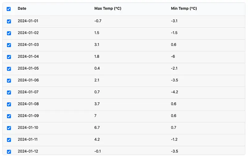
You’ll notice that numbers in a table aren’t very intuitive. For instance, if you want to find out when in January the temperature suddenly started to drop, it’s difficult to determine just by scanning the table. But once the data is plotted as a line chart, it’s a different story - you don’t even need to look at the exact numbers to instantly see the overall trend of January temperatures:
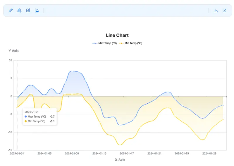
- Early January: Temperatures fluctuated slightly between –5℃ and 3℃;
- Mid-January: A clear warming peak appeared, followed by a sharp drop;
- Late January: Overall remained at a lower level;
These trends are hard to identify just by looking at a table, but a line chart makes them immediately visible. This is one of the scenarios where line charts are most suitable.
In time-series data scenarios like this - whether it’s weather changes, website traffic, or company revenue - line charts are almost always the best choice.
Comparing multiple sets of data
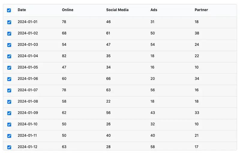
Line charts not only show how a single dataset changes over time, they are also particularly good for comparing multiple datasets. For example, here we compiled a product’s daily sales across different channels (online store, social media, advertising, and partner channels) over the course of one month.
In this type of scenario, line charts have three common forms:
(1) Standard line chart
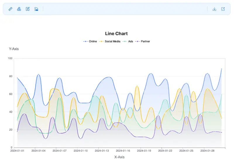
In this chart, daily sales from four channels are shown as separate lines. From the chart we can see that online sales are the highest, partner channel sales are the lowest, while social media and advertising follow relatively similar patterns.
This type of chart is suitable for answering questions like: “Which channel performs the best?” or “Who is growing?”
(2) Stacked line chart
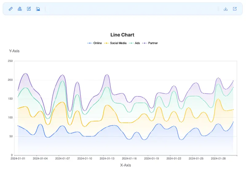
A stacked line chart adds up the values from the four channels. This way you can not only see the changes in each individual channel, but also clearly see the trend of total sales over time.
When we care about “overall market size” or “total growth trend,” the stacked line chart is the best choice.
(3) 100% stacked line chart
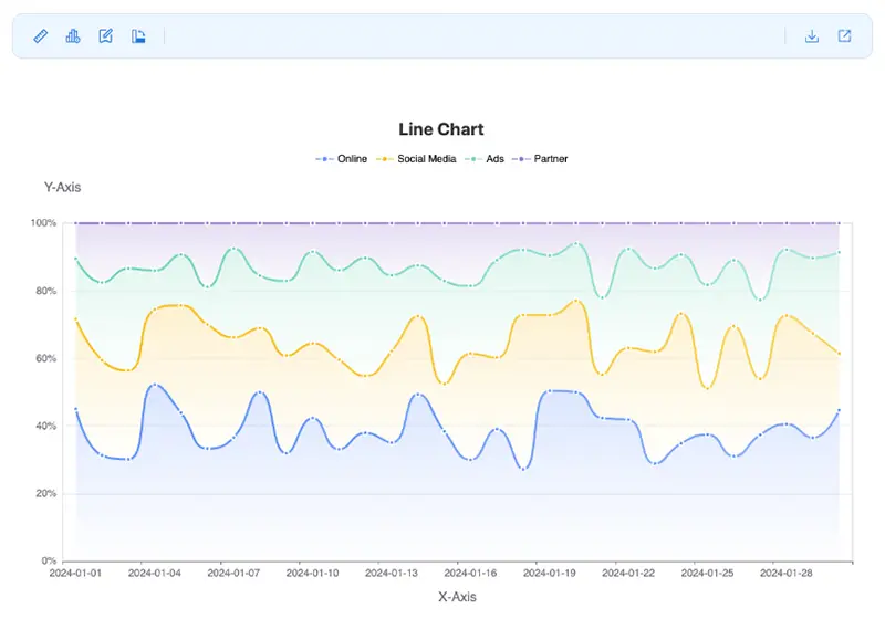
This chart goes one step further by normalizing the stacked values to percentages. Each day’s total is fixed at 100%, and different colors show the proportion of each channel.
From this chart it’s easy to see that online sales consistently account for the largest share. This type of chart is suitable for answering questions like: “What proportion does each channel take in the total?” and “Whose share is changing?”
When not to use a line chart
The following situations should be avoided when using line charts:
Data has no continuity
The biggest requirement of a line chart is that data points must have continuity.
For example, product sales:
| Product | Sales |
|---|---|
| Phone | 1200 |
| Tablet | 800 |
| Laptop | 600 |
These data points have no time or sequential relationship; they are just independent categories. If you force a line chart to connect them, it creates the false impression that “phone sales affect tablet sales.” In reality, a bar chart is more suitable here.
Too many or messy categories
The advantage of a line chart is its ability to show “clear trends.” But if you draw too many lines in one chart - for example, dozens - it results in a mess of overlapping lines, making it impossible to see the key points. This kind of visual clutter prevents you from intuitively identifying trends, so line charts should be avoided. In this case, consider using a stacked bar chart or a pie chart instead.
Emphasizing proportions rather than trends
If the purpose is to show “the proportion of each part within the whole,” then a pie chart or 100% stacked bar chart is a better choice. For example, the monthly sales share of different channels:
- Online 50%
- Social Media 30%
- Ads 15%
- Partner 5%
Because a line chart can only show whether numbers are high or low, it cannot effectively illustrate “proportional structure.”
How to quickly create a line chart
All the line charts in this article were created using EveChart. The process is simple: open the EveChart website, upload your data file (Excel or CSV), and the chart is automatically generated. Then select “Line Chart” and choose a suitable color scheme. The generated chart can be shared directly or downloaded in high-resolution PNG or lossless SVG format.
If you’d like to learn the detailed steps, check out this article: Line Chart Beginner’s Guide


 EN
EN