 Account
 Projects
 Log Out


How to Make a Scatter Plot in Excel (Step-by-Step Guide)
When you have two sets of data to compare, such as study time and exam scores, or advertising expenses and sales, the clearest way to show their relationship is with a scatter plot. In this article, I’ll guide you step by step through creating a scatter plot in Excel, show you how to make some simple style adjustments, and finally introduce an easier method for generating a polished scatter plot in just a few minutes.
How to Quickly Create a Scatter Plot in Excel
Prepare the Data
First, you’ll need a dataset. A scatter plot requires at least two columns of numeric values: one for the X-axis and one for the Y-axis. If you have a third variable, you can use it to represent point size.
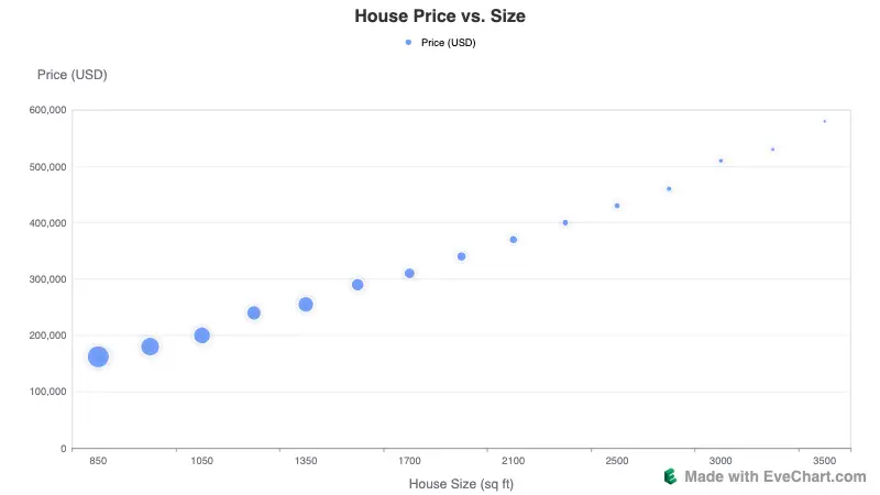
Here’s a sample dataset from U.S. real estate:
- X-axis (horizontal): House Size (sq ft)
- Y-axis (vertical): Price (USD)
- Point Size (optional): Age (Years). By default, Excel’s scatter plot uses a fixed point size. If you want point size to vary with age, you’ll need a Bubble Chart, but since that process is more complex, we won’t cover it here.
| House ID | House Size (sq ft) | Price (USD) | Age (Years) |
|---|---|---|---|
| 1 | 850 | 162,000 | 30 |
| 2 | 900 | 180,000 | 25 |
| 3 | 1,050 | 200,000 | 22 |
| 4 | 1,200 | 240,000 | 18 |
| 5 | 1,350 | 255,000 | 20 |
| 6 | 1,500 | 290,000 | 15 |
| 7 | 1,700 | 310,000 | 12 |
| 8 | 1,900 | 340,000 | 10 |
| 9 | 2,100 | 370,000 | 8 |
| 10 | 2,300 | 400,000 | 6 |
| 11 | 2,500 | 430,000 | 5 |
| 12 | 2,700 | 460,000 | 4 |
| 13 | 3,000 | 510,000 | 3 |
| 14 | 3,200 | 530,000 | 2 |
| 15 | 3,500 | 580,000 | 1 |
Once plotted, this data reveals a clear relationship between house size and price.
Insert a Scatter Plot
With your data ready, create the chart in Excel:
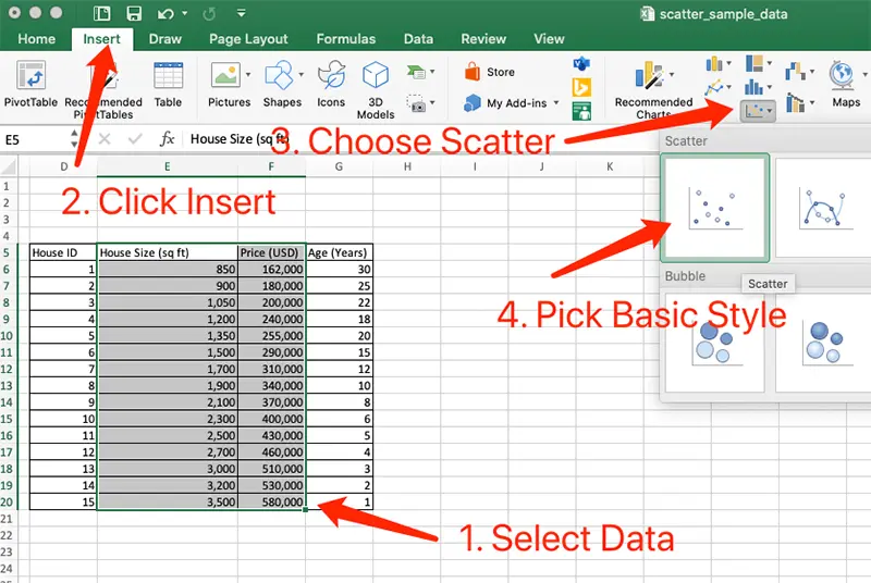
Select the Data Range
Highlight the “House Size” and “Price” columns (exclude the House ID column).Open the Insert Menu
Click the Insert tab on the top menu → find the Scatter (Scatter Plot) icon in the Charts section.Choose the Basic Style
From the dropdown, select “Scatter with only Markers”.
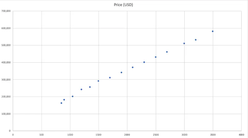
Excel will generate a scatter plot with house size on the X-axis and price on the Y-axis, where each point represents a house.
Tip: In a default scatter plot, point sizes don’t vary. If you want them to reflect a third variable (like Age), you’ll need a Bubble Chart, but that requires more setup, so we won’t cover it here.
Adjust the Chart Style
By default, Excel’s scatter plots look quite plain. A few formatting tweaks can make them much clearer:
Add a Title
Click the chart title box and replace it with something more descriptive, like House Price vs. Size.Add Axis Titles
In the menu, go to Chart Design → Add Chart Element → Axis Titles, then label both axes.- X-axis: House Size (sq ft)
- Y-axis: Price (USD)
Change Point Style
Right-click on any point → Format Data Series. In the right-hand panel, you can adjust:- Point Size (Marker Size): Increase to 8–10 for better visibility.
- Point Color (Marker Fill): Switch to a more noticeable color, such as blue or green.
Remove Unnecessary Elements
Delete excess gridlines and enlarge axis label fonts to improve readability.
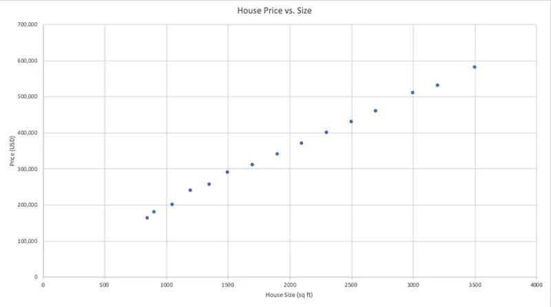
After these edits, your chart will look cleaner and more professional, ideal for reports or presentations.
Limitations of Scatter Plots in Excel
Excel can create scatter plots, but you may encounter some drawbacks:
Fixed Point Size
- Standard scatter plots can’t map a third variable (like Age) to point size.
- To do so, you must use a Bubble Chart, which requires extra formatting.
Time-Consuming Formatting
- Fonts, colors, and labels must be adjusted one by one.
- If you need multiple charts with consistent styles, you’ll have to repeat the process manually.
Limited Export Quality
- Copying charts into Word or PowerPoint often reduces clarity.
- Even saved images can look blurry when enlarged, making them unsuitable for academic or professional use.
Difficult to Share
- Charts are tied to local files.
- To share them, you must send the file; there’s no built-in way to create an online link.
A More Efficient Option: Try EveChart
If building scatter plots in Excel feels too tedious, try EveChart, a free online chart generator. It lets you create polished charts in minutes, with easier customization and better sharing options.
Upload Data, Generate Instantly
Visit the EveChart website, upload your Excel or CSV file, and the system will automatically parse your data. Select Scatter Plot, choose your X and Y columns, and your chart is ready instantly.
If you have a third variable (like Age), you can map it directly to point size, no need to switch to a Bubble Chart.
Edit Online, Preview in Real Time
Want to update the title or axis labels? Just click and edit. EveChart also includes preset color themes, so you can experiment and see changes instantly without repetitive manual formatting.
High-Resolution Export, Ready Anytime
Download your chart as a high-resolution PNG, or export it as an SVG for print-perfect clarity at any scale.
In addition to scatter plots, EveChart supports bar charts, line charts, and pie charts, covering a wide range of common visualization needs.


 EN
EN