 Account
 Projects
 Log Out


How to Make a Pie Chart in Excel (Step-by-Step Guide)

Creating a pie chart in Excel isn’t complicated. All you need are two columns of data (categories and values). Select the data, then click Insert → Charts → Pie Chart, and Excel will automatically generate a basic pie chart.
In this tutorial, we’ll walk through step by step how to create a pie chart in Excel. We’ll cover preparing the data, inserting the chart, customizing labels and colors, and highlight the most common mistakes to avoid. By the end, you’ll know not only how to make a pie chart in Excel, but also how to make it look professional and easy to read.
Prepare the Data
Before making a pie chart in Excel, the first step is to prepare your data. The structure is very simple: usually just two columns, one for categories and one for values (the values must be numeric, otherwise Excel can’t calculate them).
For example, if we want to create a pie chart for fruit sales, the data might look like this:
| Fruit | Sales |
|---|---|
| Apple | 50 |
| Banana | 30 |
| Orange | 20 |
With this table, Excel can calculate the share of “Apple,” “Banana,” and “Orange” in the whole pie.
Two quick reminders:
- Keep the number of rows small. Each row becomes one slice. If you have too many rows, the pie will look crowded and hard to read.
- Keep units consistent. Don’t mix values like “people” and “dollars” in the same chart.
Once the data is structured correctly, it’s ready to be turned into a pie chart.
Insert a Pie Chart in Excel
Once the data is ready, the next step is to turn it into a chart. Here’s how:
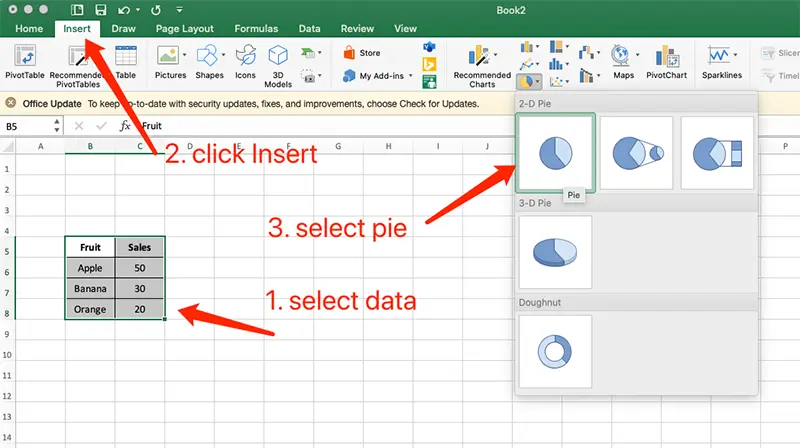
Select your data
Highlight the two columns (categories + values). For example, “Fruit” and “Sales.”Go to Insert menu
In the top ribbon, click Insert, then look for the Pie Chart icon in the Charts section.Choose a chart style
Excel offers several options: 2D Pie, 3D Pie, Doughnut, etc. For clarity, it’s best to start with the 2D Pie Chart.Generate the chart
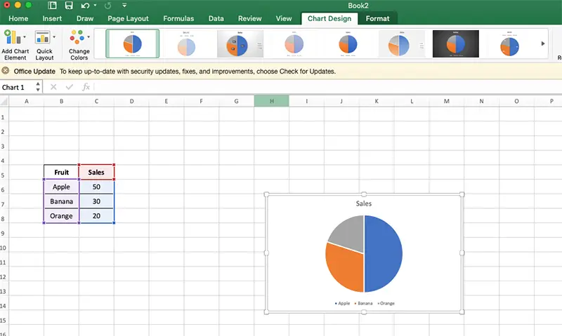
Once selected, Excel will instantly create a pie chart in your worksheet, showing the proportions of each slice.
Customize Your Pie Chart
Generating the chart is only the first step. To make it clear and professional, you’ll want to customize it. Here are some practical adjustments:
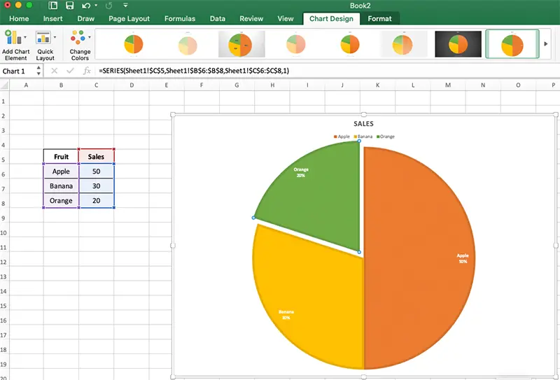
1. Change the title
By default, Excel adds something generic like “Chart 1.” Double-click to edit it and change it to something meaningful, like “Fruit Sales Distribution.”
2. Add data labels
A pie chart shows proportions, but without labels it’s hard to interpret. Right-click on the chart → Add Data Labels to display percentages or values. Usually one is enough, so don’t overcrowd it.
3. Adjust colors
Default colors may be too similar. To fix this, select the chart, go to Chart Design → Change Colors, and pick a clear color scheme. For example, apples in red, bananas in yellow, oranges in orange.
4. Use quick styles
Excel has built-in styles with shadows, effects, and preset color palettes. These can improve the look instantly. Just be careful — flashy effects can reduce readability.
5. Highlight one slice (Exploded Pie Chart)
If you want to emphasize one category, say “Orange sales are the lowest,” select that slice and drag it outward. This creates an “exploded pie” effect that draws attention.
Common Mistakes to Avoid
Pie charts are simple, but misused they can confuse rather than clarify. Here are common pitfalls:
1. Too many slices
If your pie chart has 15 or 20 slices, no one can see the differences. Pie charts work best with under 10 categories. If you have more, consider using a bar chart or line chart.
2. Similar colors
Light blue and light green may look almost the same. Always use high-contrast colors, or colors that relate to the category (apples red, bananas yellow, etc.).
3. Overloaded labels
Showing both values and percentages clutters the chart. Stick with percentages, and if needed, use a legend.
4. Overusing 3D effects
3D pie charts look fancy, but the perspective distorts the proportions. A front slice may look bigger than it is, while the back looks smaller. Use 3D only for visual effect, not for serious data.
5. Mixed units
If one slice is “people” and another is “dollars,” the chart makes no sense. A pie chart must represent parts of the same whole.
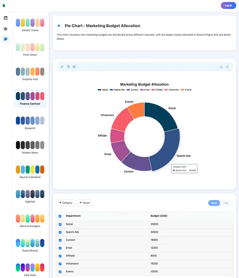
Beyond Excel: Faster & Better Pie Charts Online
Excel is great for data processing, but when it comes to quick presentation, it can feel clunky: formatting takes time, exported images lose clarity, and the charts are static.
That’s where EveChart comes in. It’s not a replacement for Excel, but a complement — designed to help you present data more beautifully and interactively:
- Upload Excel or CSV files and instantly generate a pie chart
- Clean, professional themes by default — no manual tweaking needed
- Interactive charts: hover to view details, click a slice to highlight
- One-click HD export (PNG, SVG) for presentations and print
- Share with a link or embed with iframe, and others can interact with your chart
Excel is great for analysis. EveChart is better forsharing, presenting, and impressing.


 EN
EN