 Account
 Projects
 Log Out


How to Create a Stacked Bar Chart in Excel (Step-by-Step Guide)

Many people run into the same problem when making charts in Excel: they know they need a stacked bar chart but hesitate in the menu, unsure which button to click. In the end, the chart they create doesn’t look right. The truth is, the steps are not complicated — what’s missing is a clear guide. I’ll break down the process step by step. Follow along, and you’ll quickly learn how to create a stacked bar chart in Excel.
Step 1: Prepare the Data
Before creating a stacked bar chart, the first step is to prepare the data. As an example, I’m using the “Paris 2024 Olympic Medal Table (Top 25 Nations)” dataset. Each row represents a country, and the three columns show the number of gold, silver, and bronze medals. This structure is perfect for a stacked bar chart: the horizontal axis is the country, the vertical axis is the medal count, and the stacked segments show which countries rely more on gold, silver, or bronze.
| Country | Gold | Silver | Bronze |
|---|---|---|---|
| United States | 40 | 44 | 42 |
| China | 40 | 27 | 24 |
| Japan | 20 | 12 | 13 |
| Australia | 18 | 19 | 16 |
| France | 16 | 26 | 22 |
| … | … | … | … |
You can find this data on the [Wikipedia Medal Table page] or the [Official Olympics website]. (Or you can directly download the prepared dataset here: Sample Data CSV)
When organizing the data, keep in mind:
- Keep the table clean: Don’t merge cells or add extra text in headers.
- Ensure numbers are numbers: Data copied from webpages may contain spaces or symbols that Excel can’t read correctly.
- Total column is optional: You can add a “Total” column to sort more easily, but when making the chart, you only need Gold, Silver, and Bronze.
The dataset I’ve provided is already suitable for a stacked bar chart, so no extra changes are needed. Next, let’s insert the chart.
Step 2: Insert the Stacked Bar Chart
Open the data file in Excel, then follow these steps:
Select the data range
Highlight the table (Country + Gold/Silver/Bronze columns). Don’t include the “Total” column, since the stacked chart is meant to show medal breakdowns, not just totals.Find the stacked bar chart button
In Excel’s top menu, go to Insert → Column or Bar Chart. A few icons will appear. Choose the second one, which looks like stacked blocks — this is the Stacked Column Chart.Confirm the result
Each country will have one bar, divided into three colored sections (Gold/Silver/Bronze). If there are many rows, the chart may look crowded. Don’t worry about formatting yet; just confirm the chart is generated.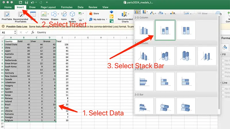
Common pitfalls
- Order is wrong: Excel may reorder the horizontal axis. Fix it by right-clicking → “Select Data” → adjust order.
- Colors are unintuitive: By default, silver may look brighter than gold. We’ll fix this in the beautification step.
- Wrong chart type: If you pick “100% Stacked Column Chart,” all bars will have the same height and only show proportions. Switch back to “Stacked Column Chart.”
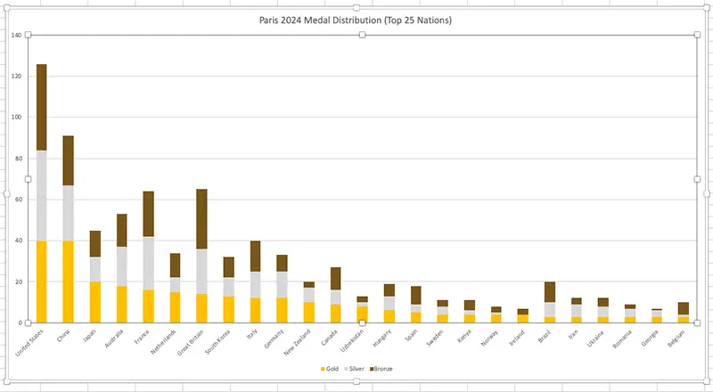
Step 3: Beautify the Chart
Inserting the chart is just the start. To make it clear and presentable for reports or PPTs, you’ll need some quick adjustments. Excel’s default stacked bar charts often have issues: unclear colors, small fonts, and awkward legend placement. Here’s how to fix them:
Use intuitive colors
- The default blue, orange, and gray don’t clearly represent medals.
- Suggested scheme: Gold → golden yellow, Silver → light gray, Bronze → brown/copper orange. This way, it’s obvious at a glance without checking the legend.
Adjust axes and fonts
- With many countries, axis labels may overlap. Rotate them diagonally.
- Increase font size slightly to avoid looking cramped in presentations.
Optimize legend and title
- Place the legend above or below the chart instead of squeezed to the right.
- Use a clear title, for example: “Paris 2024 Medal Distribution (Top 25 Nations)”.
At this point, you’ll have a clear, intuitive stacked bar chart. If the dataset has too many rows, it may still look crowded. It’s best to limit it to around 30 rows, or only show key data.
When to Use a Stacked Bar Chart
After learning a new chart type, many people overuse it. But stacked bar charts aren’t universal — they’re best for specific cases.
In one sentence: Stacked bar charts are for “whole–part” comparisons. They let you see both totals and how those totals are broken down.
Typical uses:
- Medal tables (total + breakdown): As in our Olympic example — you can see both the medal count and Gold/Silver/Bronze distribution.
- Company revenue breakdown: Showing how different business lines contribute to revenue.
- Market share analysis: Regions as bars, brands stacked inside, showing total market size and brand proportions.
- Cost structure: Budgets with projects as bars and categories (personnel, materials, promotion, etc.) stacked inside.
Not suitable when:
- You only want to compare totals → use a simple bar chart.
- You mainly care about proportions → use a 100% stacked bar chart.
- You have too many categories (dozens or more) → the chart becomes unreadable.
Simply put, a stacked bar chart helps you “see totals + breakdowns in one chart.” Use it correctly, and it’s powerful; use it incorrectly, and it just creates confusion.
A Faster Way: Create a Stacked Bar Chart Online
Making a stacked bar chart in Excel isn’t difficult, but it does take several steps: preparing data, inserting the chart, and adjusting styles. For someone who just wants a polished chart quickly, this can feel tedious.
That’s where the EveChart Online Chart Generator comes in:
- Upload your table (CSV or Excel file).
- Select Stacked Bar Chart as the chart type.
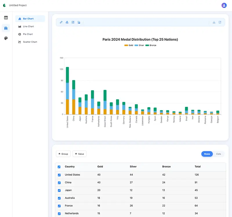
The system automatically handles colors and layout, and you can export high-resolution images with one click — perfect for PPTs or reports.
Compared with Excel, the advantages are:
- Faster: Generate charts in just a few steps.
- Cleaner: Default color schemes are intuitive and readable, no tweaking needed.
- Easier to share: Export HD images directly or copy share links.
And not just bar charts — with EveChart you can also create Line Charts, Pie Charts, or Scatter Plots with a single click. If you often need charts but don’t want to spend time adjusting in Excel, EveChart is a convenient alternative.


 EN
EN