 Account
 Projects
 Log Out


How many categories are ideal for a pie chart?

Many people run into the same problem when creating pie charts: how many categories should you include? Too few categories, and the chart feels pointless; too many, and the pie ends up looking like a pizza cut into countless tiny slices, with overlapping labels that no one can read clearly.
First, here’s the conclusion: the ideal range is 3 to 6 categories. This ensures each slice has enough space while clearly showing the proportions. But why limit it to this range? And what if your dataset has far more than 6 categories? Let’s break it down.
How many categories are considered “ideal”?
When preparing a pie chart, the first question is: how many categories should be displayed? Most data visualization experts recommend keeping it between 3 and 6. This range balances clarity and information, while avoiding a chart overcrowded with slices.
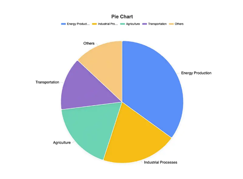
If your dataset naturally falls within this range, it’s perfect material for a pie chart. For example, the dataset below has 5 categories and clearly shows the share of different greenhouse gas emission sources:
Global Greenhouse Gas Emissions by Source (World Bank, 2022)
| Source Category | Share |
|---|---|
| Energy Production | 35% |
| Industrial Processes | 20% |
| Agriculture | 18% |
| Transportation | 14% |
| Others | 13% |
However, this isn’t a strict rule. For example, in special cases—such as printing a large image or displaying on a high-resolution screen—even a dozen categories may still be readable. The key question is: can the viewer quickly understand the proportions, and are the labels easy to read without overlapping?
So, “3 to 6 categories” works as a general guideline, but you should always judge based on your dataset and display scenario.
Why limit the number of categories in a pie chart?
We know that cramming too many categories into a pie chart results in chaos. But how do you know when it’s “too many”? Here are a few simple checks:
- If the smallest slice is just a thin sliver (say, 5% or less), it’s practically invisible.
- If the labels overlap and lines get tangled, you’ve already exceeded what a pie chart can handle.
- Try the 5-second test: show the chart to a colleague for 5 seconds, then ask which categories are largest. If they can’t answer, the chart isn’t effective.
Context also matters. On a mobile phone, more than 6 categories is difficult to read. In a PowerPoint presentation, staying under 5 is safest. On a poster or large display, 8–10 may still work.
The point of limiting categories isn’t to force you to stick to 6, but to remind you: the strength of a pie chart is showing category proportions at a glance.
How to handle too many categories?
Sometimes, datasets come with dozens of categories and you can’t avoid it. For instance, the U.S. Department of Agriculture’s food consumption data includes over 30 food categories:
| Food Category | Share |
|---|---|
| Beef | 8.2% |
| Pork | 6.9% |
| Chicken | 7.1% |
| Turkey | 1.5% |
| Fish | 2.1% |
| Vegetables (subdivided into 10+ categories) | 15.6% |
| Fruits (subdivided into 12+ categories) | 14.3% |
| Grains (subdivided into 8+ categories) | 20.5% |
| Dairy (subdivided into 6+ categories) | 10.7% |
| Others | 13.1% |
| … | … |
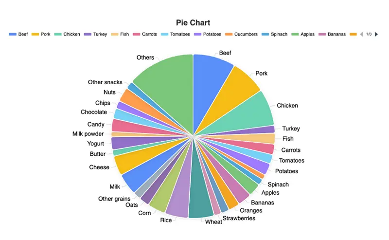
Drawn as-is, the chart becomes a cluttered circle of tiny slices where the main message is lost. What can you do?
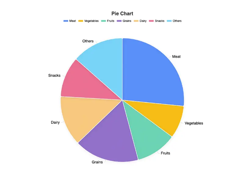
1. Merge similar categories
This is the most common and effective fix. For example, group all “Vegetables” into one category, “Fruits” into another, and “Meat” into a third. Suddenly, 30+ categories become 5 or 6, and the pie chart becomes much clearer.
2. Set an “Others” category
Combine very small slices (less than 3–5%) into “Others.” As long as “Others” doesn’t exceed 15–20% of the chart, the result is still easy to interpret.
3. Switch to another chart type
Some datasets simply aren’t suitable for pie charts. If you need to display dozens of categories, a horizontal bar chart is usually clearer—especially when comparing long-tail data.
4. Use grouped display
If you want detail without losing clarity, split the data into two charts: one for the main categories (like “Meat,” “Grains,” “Fruits”) and another zoomed-in chart breaking down a single group (such as types of fruits). This keeps both the overview and the detail.
Efficiently creating pie charts
The key principle: don’t overload your pie chart with categories. It should communicate the proportions instantly. If your dataset is too detailed, merging categories, using “Others,” or switching to another chart type are all practical solutions.
Of course, that’s easier said than done. You may face challenges like:
- How should categories be merged?
- Is switching between chart types a hassle?
- How do you ensure clarity across different display scenarios?
Instead of tweaking everything manually, free online tools like EveChart can help. You can upload your dataset, automatically generate pie charts, easily merge categories, switch chart types, and export high-resolution images—without the extra work.


 EN
EN