 Account
 Projects
 Log Out


5 Best Pie Chart Examples (And How to Create Yours Online)

Pie charts are probably the most straightforward type of chart, allowing readers to instantly see the relationship between the whole and its parts. But even though they all fall under the same category, their presentation and effectiveness can vary a lot depending on the context. Below are 5 common pie chart examples with real-world data to help you better understand their uses — and also learn how to create them quickly.
Basic Pie Chart
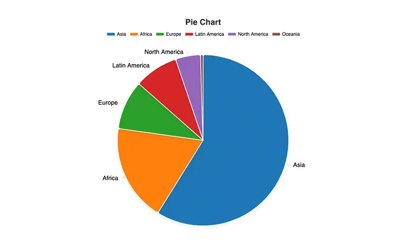
When people think of pie charts, the first thing that usually comes to mind is the basic version. It divides a whole into several slices, making it easy to see which part is larger and which is smaller at a glance.
For example, the table below shows the world population by continent in 2024 (data from the United Nations Population Division):
| Continent | Population (billion) | Share of Global Population |
|---|---|---|
| Asia | 4.75 | 59% |
| Africa | 1.48 | 18% |
| Europe | 0.75 | 9% |
| Latin America | 0.67 | 8% |
| North America | 0.38 | 5% |
| Oceania | 0.04 | 1% |
| Total | 8.07 | 100% |
If you plot these numbers in a pie chart, Asia takes up more than half, Africa about one-fifth, while the other continents appear relatively smaller. With such a chart, readers immediately see that Asia is the most populous continent in the world.
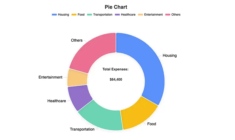
Donut Chart
A donut chart is essentially a variant of the pie chart, except it leaves a blank space in the center. This small change not only makes the chart look more modern but also allows you to display the overall figure in the middle, creating a dual layer of information.
For example, the table below shows a household’s annual expenses (data from the U.S. Bureau of Labor Statistics):
| Category | Amount (USD) | Share |
|---|---|---|
| Housing | 21,400 | 33% |
| Food | 9,300 | 14% |
| Transportation | 10,800 | 17% |
| Healthcare | 5,700 | 9% |
| Entertainment | 3,900 | 6% |
| Others | 13,300 | 21% |
| Total | 64,400 | 100% |
When displayed as a donut chart, readers can easily see that housing takes the largest portion (about one-third), while the center space can directly show “Total Expenses: $64,400.” This makes the chart both clear and intuitive.
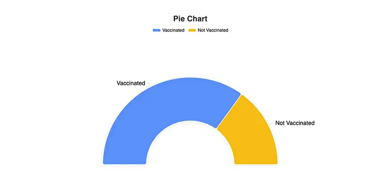
Semi-Circle / Percentage Pie Chart
Sometimes, we don’t want to show the distribution of all categories. Instead, we only care about how much of a goal has been completed. In this case, a semi-circle pie chart or a percentage pie chart works particularly well.
For instance, the following table shows a city’s vaccination progress (example data, unit: 10,000 people):
| Status | People | Share |
|---|---|---|
| Vaccinated | 350 | 70% |
| Not Vaccinated | 150 | 30% |
| Total | 500 | 100% |
If plotted as a semi-circle pie chart, the figure looks like a progress bar: 70% of the arc filled, with the remaining 30% left blank. Compared to a full pie chart, this presentation feels much more like “progress.”
This type of chart is commonly used in project management, healthcare data, education coverage, or any situation where you need to show “completed vs. remaining.”
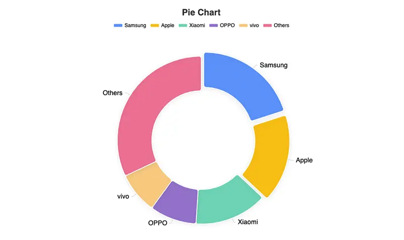
Exploded Pie Chart
In some datasets, not all parts are equally important. Sometimes you want to highlight one slice, and that’s where the exploded pie chart comes in. The idea is simple: pull one slice slightly out from the circle to draw attention.
For example, the table below shows global smartphone market share in Q2 2024 (data from IDC):
| Brand | Market Share |
|---|---|
| Samsung | 20% |
| Apple | 17% |
| Xiaomi | 14% |
| OPPO | 9% |
| vivo | 8% |
| Others | 32% |
In an exploded pie chart, if we pull out the “Apple” slice, the first impression readers get is that Apple holds a significant position in the market. This type of design is great for market analysis, budget allocation, and similar contexts, as it highlights the key data without obscuring the overall picture.
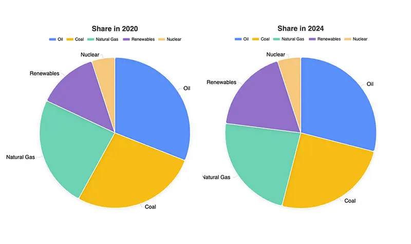
Comparison Pie Charts
A single pie chart only tells you the composition at one point in time. To observe changes or trends, you need multiple pie charts side by side.
For instance, the table below shows global energy consumption structure in 2020 and 2024 (data from the International Energy Agency, IEA):
| Energy Source | Share in 2020 | Share in 2024 |
|---|---|---|
| Oil | 31% | 29% |
| Coal | 27% | 25% |
| Natural Gas | 24% | 23% |
| Renewables | 13% | 18% |
| Nuclear | 5% | 5% |
When you place the 2020 and 2024 pie charts side by side, it’s easy to see that traditional energy sources like oil and coal are decreasing, while renewables are rising. The numbers alone tell the story, but the visual impact of the charts makes it much more intuitive.
Create Pie Charts Quickly with EveChart
These charts may look complex, but in fact you can easily create them online with EveChart. All you need to do is:
- Upload your Excel or CSV data
- Choose the pie chart type (basic, donut, semi-circle progress, etc.)
- Customize colors, titles, or labels as needed
- Export high-quality charts with one click, or generate a shareable link
Unlike traditional software, EveChart doesn’t require plugins or complicated steps. In just a few clicks, you can create a clean, professional-looking chart that’s perfect for reports, presentations, or sharing online.
👉 Try EveChart now, and create your own pie chart in seconds.


 EN
EN